HAPI Protocol
A complete visual refresh of HAPI Protocol, from brand identity and
communication to its digital products and website.
scalability and visual clarity across different applications.
1Graphic Mark
- Inconsistent line weights and spacing
- A mix of rounded and sharp endings
- Uneven line geometry and flow
- Poor legibility at small sizes
- Very limited performance on dark backgrounds
2Wordmark
The four uppercase letters in HAPI offered little visual distinction in most typefaces, making the wordmark feel generic and static.

Before the Redesign
The website had an interesting visual direction, but was difficult
to maintain, update and scale.

made the brand feel inconsistent and
visually fragmented.
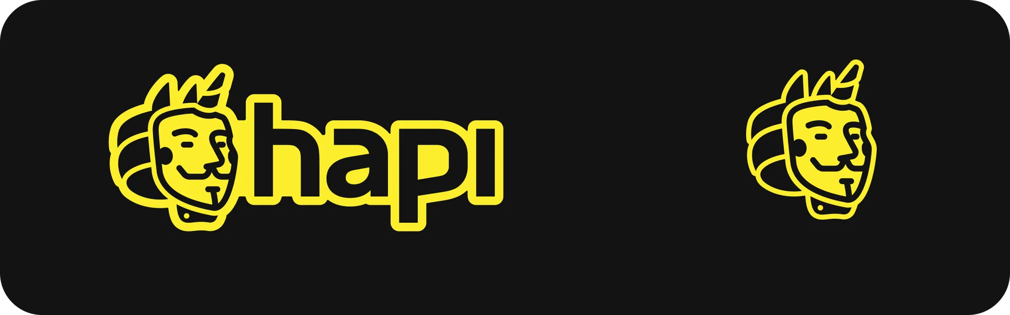
A New Identity
The new identity keeps the recognizable character of HAPI
while making it more distinctive, flexible and scalable.

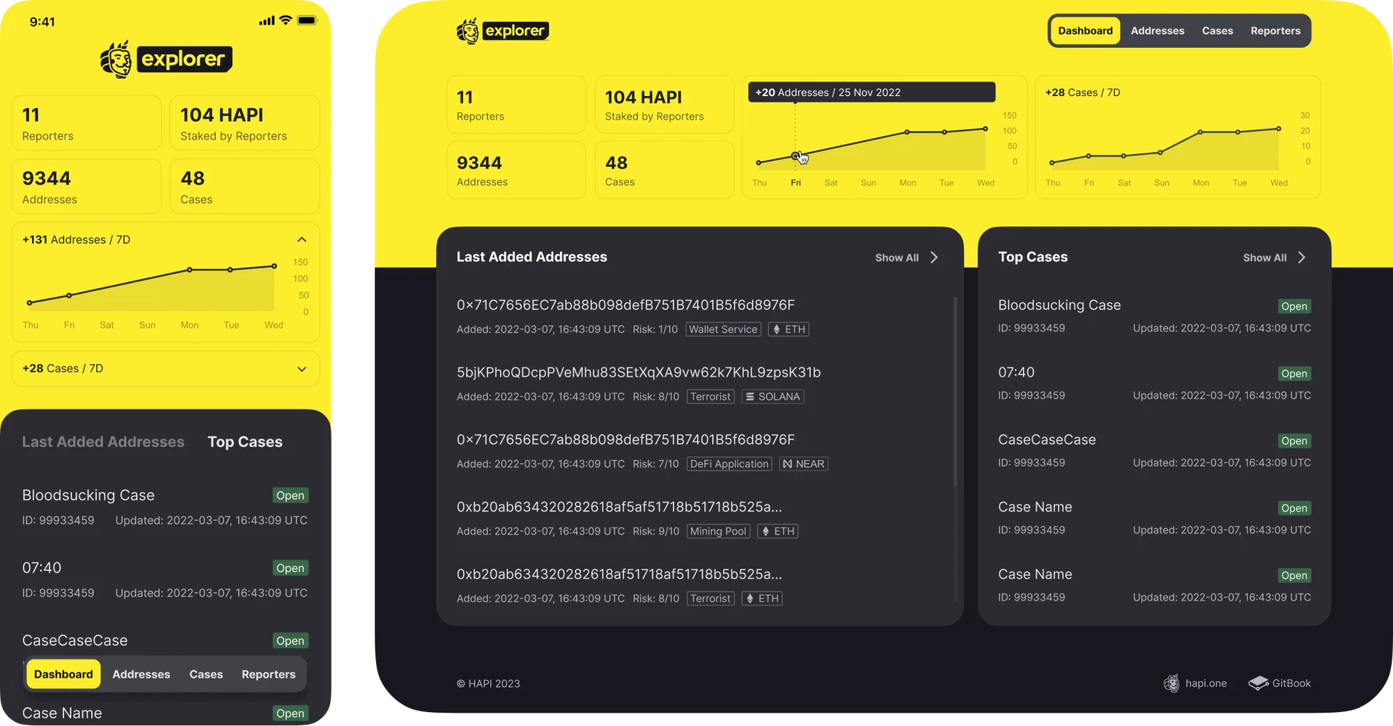
One Identity, Multiple Products
The new identity was extended across HAPI’s growing
ecosystem of products and services.

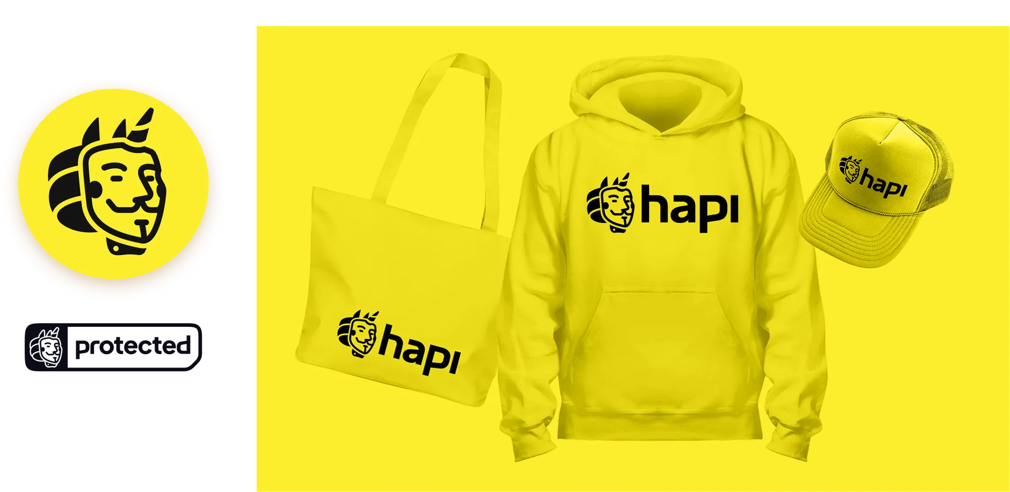
Brand in the Real World
Extending the identity into physical brand assets and
merchandise.
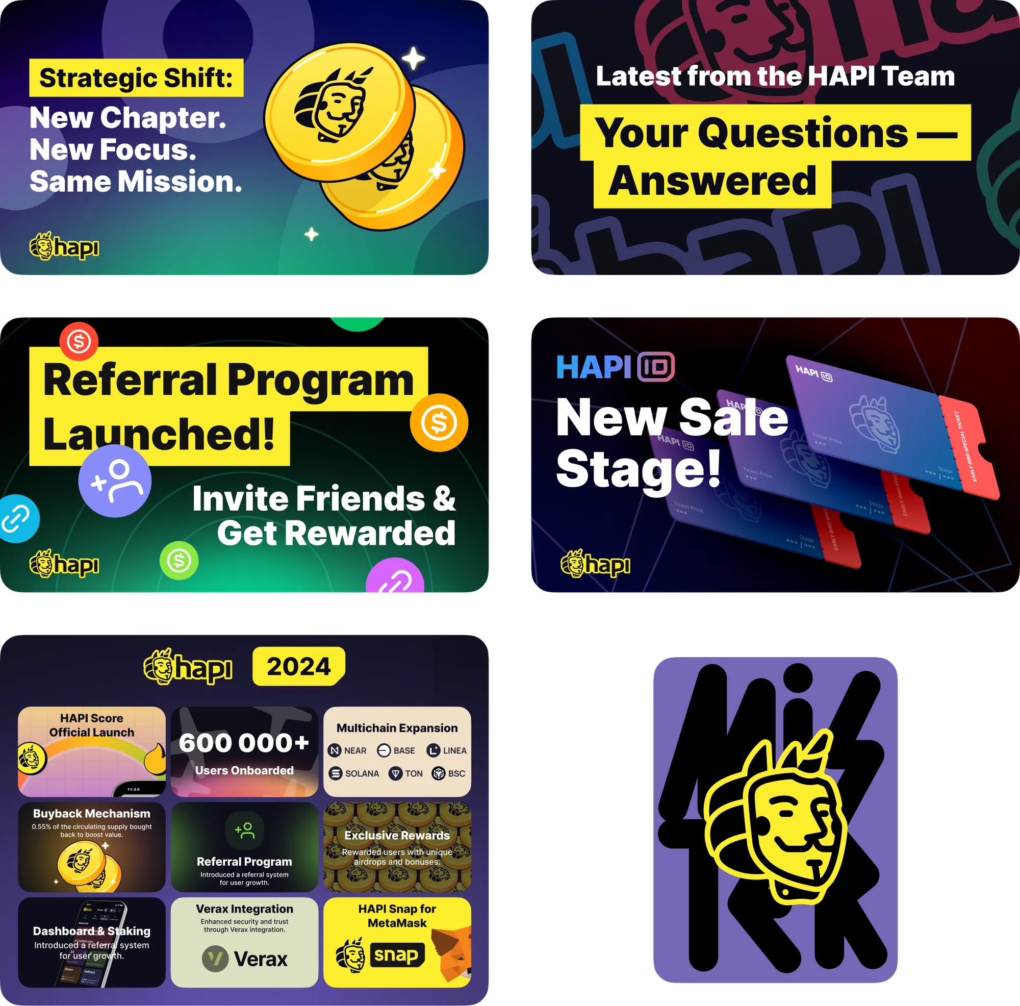
A Consistent Visual Language
A unified system for campaign graphics makes every banner
instantly recognizable as HAPI.
A New Digital Experience
The new website brings the updated identity into a clearer,
more scalable and user-friendly experience.

Complex blockchain security products are presented in a language that
works for both industry professionals and users new to the space.
Designing the Ecosystem
The same visual system was applied to HAPI’s internal
products, creating a consistent experience across the
ecosystem.