Crypto exchange redesign &
product design
Redesigned the EXMO brand and digital products, including the trading platform, mobile apps,
account area, marketing pages and visual communication.
+34% transaction growth following the redesign, marketing and PR initiatives.
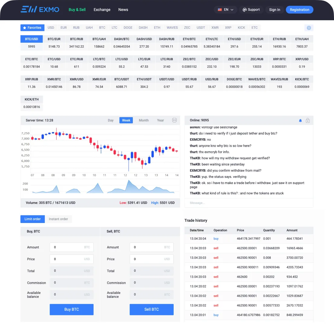
The existing interface was information-heavy, visually
fragmented and difficult to adapt to different user needs.
- Complex trading layouts with limited flexibility
- Inconsistent visual hierarchy
- No dark theme
- Outdated visual language across the product and brand
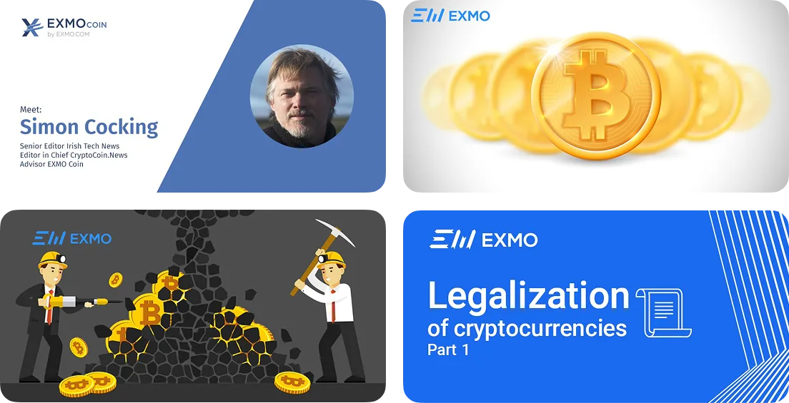
A flexible system for a growing product
The redesign started with a new visual language and a scalable design system,
creating a consistent foundation across the entire EXMO ecosystem.
Brand refresh
Refined the existing logo while preserving its recognizable form, improving proportions, angles and stroke weights.
Design system
Created a unified system for building interfaces, components and responsive layouts.
Trading experience
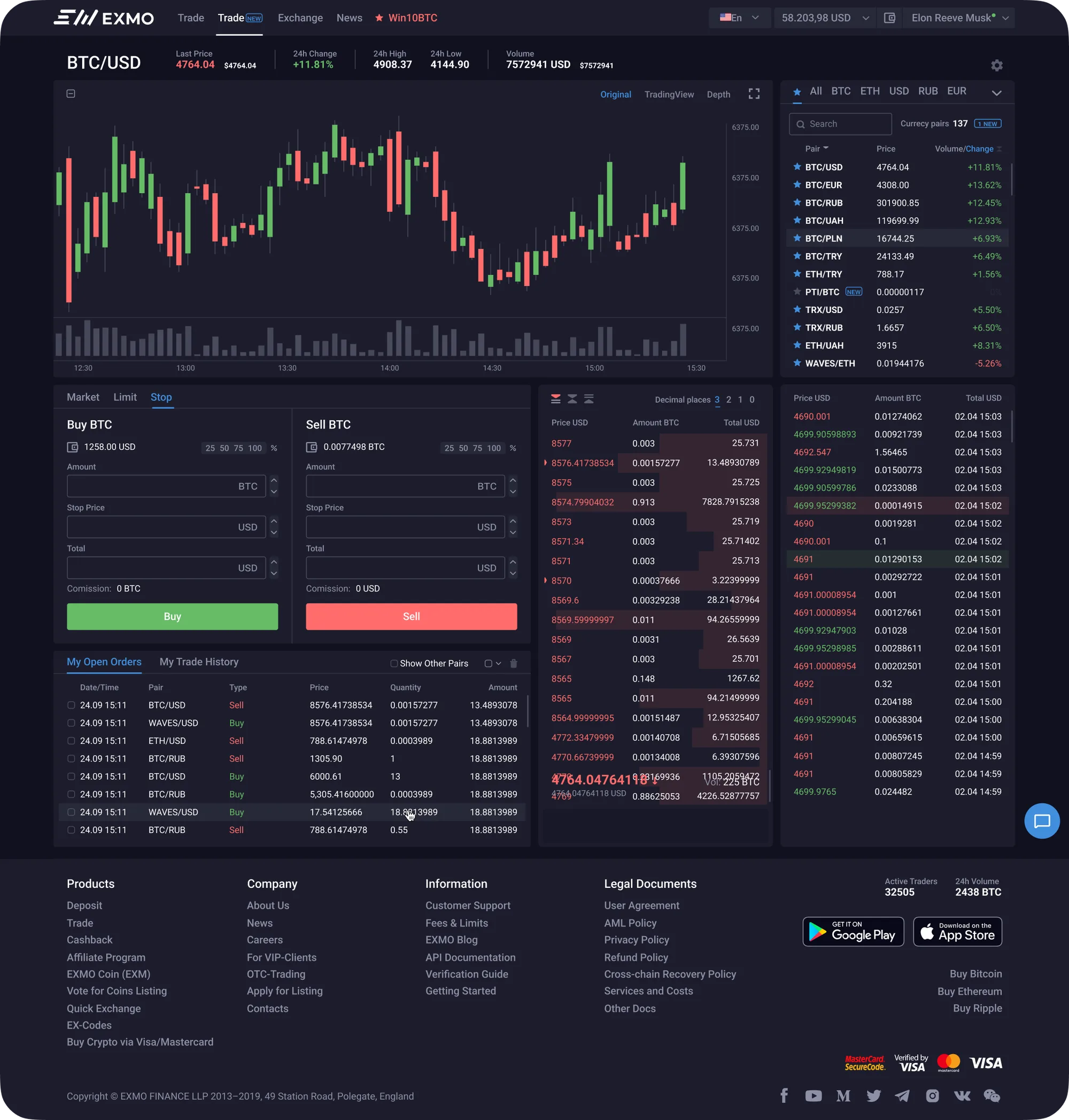
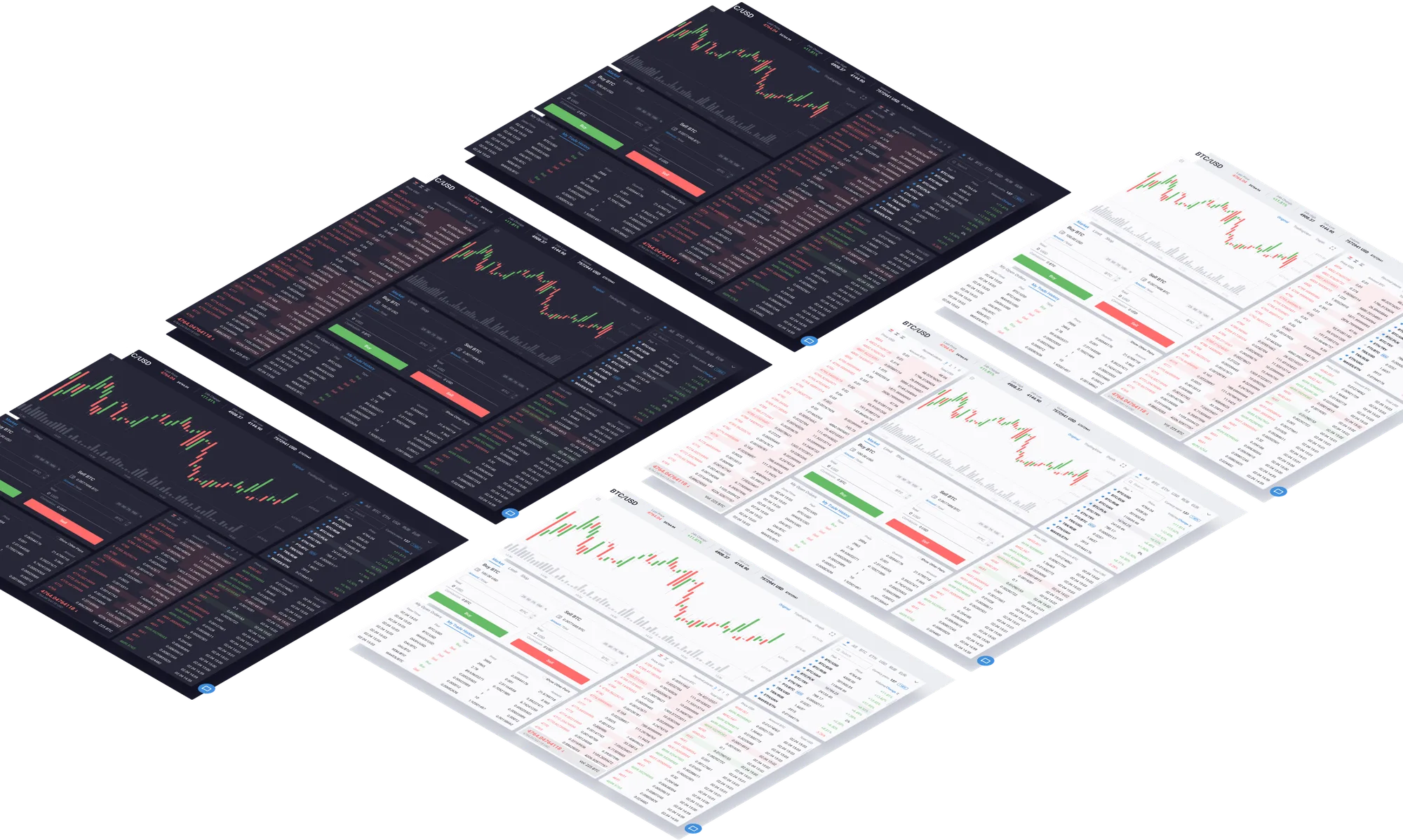
Redesigned the trading interface around clarity and flexibility. Three alternative layouts allow users to arrange the workspace according to their preferences.
Dark mode
Introduced a complete dark theme across the website and mobile products.

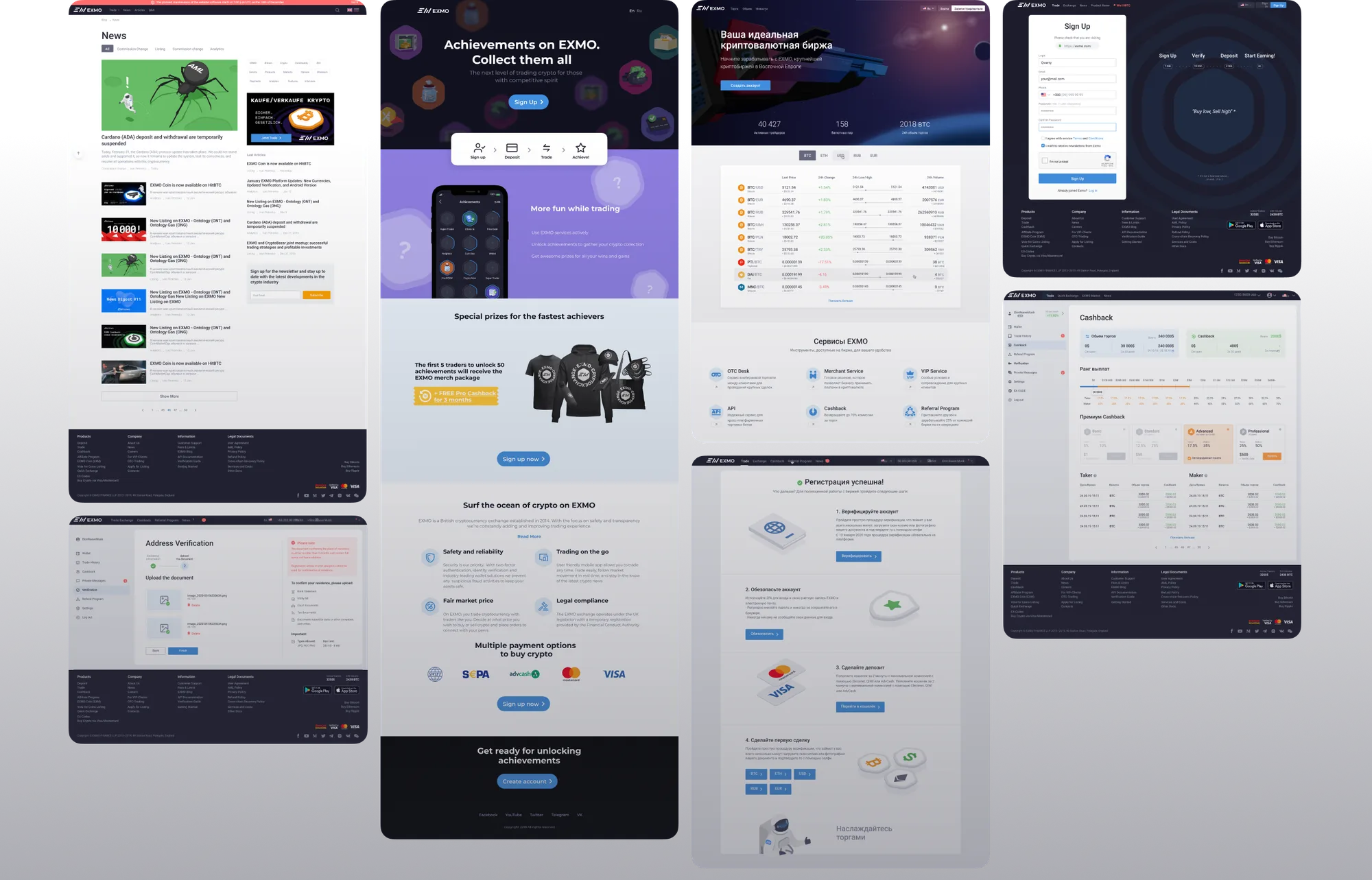
A new visual language
Developed a unified visual direction for social media, advertising, promotional materials and
physical merchandise, extending the new brand language beyond the product.

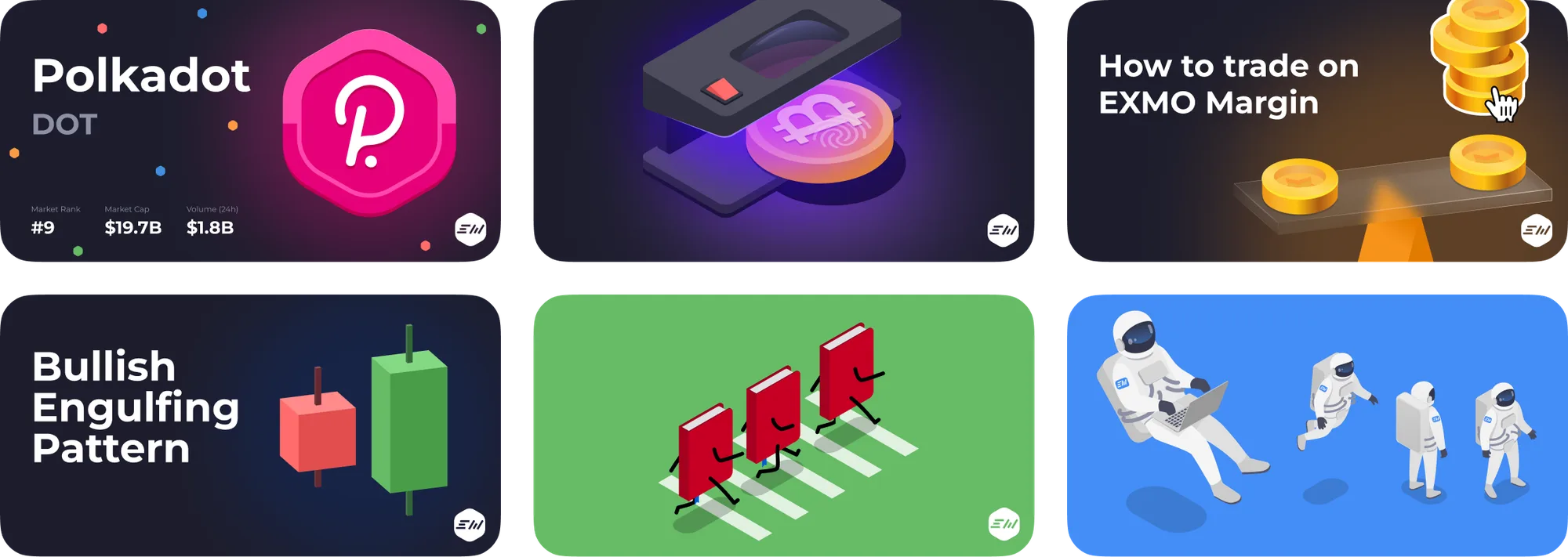
Everything you need.
Nothing you don’t.
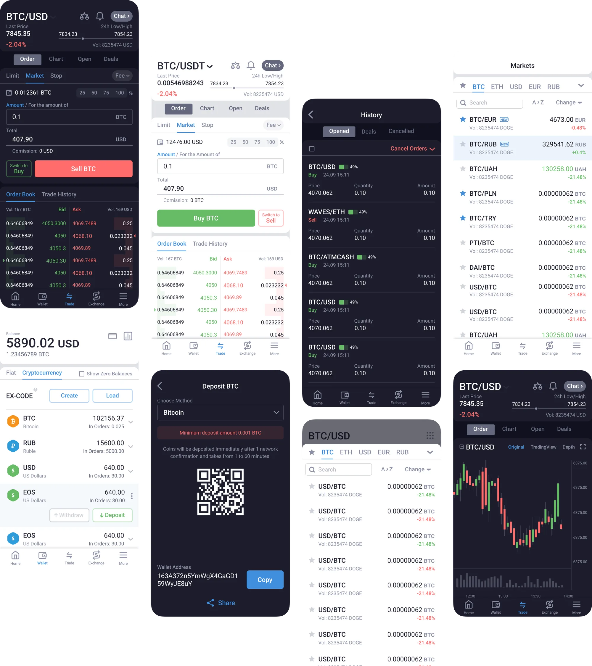
Designed the EXMO mobile experience from the
ground up for iOS and Android.
The core principle was simple: remove everything
that doesn’t help users trade.
The result was a clearer, more focused mobile
experience with the same visual and interaction
principles as the desktop platform.

Results
+34% transactions
